3 Magazine Analysis High Fashion

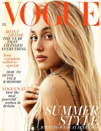
The close-up shot of Ariana Grande takes up almost the whole cover. This is to draw the readers attention to her. The rise end scene is also more natural with Ariana wearing minimal makeup and it focuses on her rather than what she's wearing, it also ads to the minimalistic feel and colour scheme. The way she is styled could also be targeted to an AB 16-25 female audience because of the minimal style because it appears expensive and high end. Often women in this age category will dress in similar ways because it keels expensive and high fashion.
They also might replicate the style in the magazine cover because of its expensive and trendy look. The magazine title covers Grande's head but this doesn't draw the attention from her, the title being in red helps the reader to see the title as well. There is a good balance between the title and the image. The colours are also very classy, they are bright and high end, for example, red and black are royal colours. This can reflect the aims of the sort of people reading Vogue and what they are wearing and how they style themselves. They also stand out on the nuetral background and draw the readers attention. Ariana has direct eye contact with the reader and this gives a more inviting feel and will make the reader want to buy the magazine.
Ariana's fans will also feel influenced to buy the magazine because she has such a large fanbase and Vogue knows this. They have used Grande as the main cover picture because of her star image and she also shows the magazines ideals because Ariana is a strong supporter of feminism and is very influentual. Her fanbase is also likely to fall in the 16-25 category that read Vogue, therefor the magazine will sell well. The whole feel of the magazine feels very feminine and classy, this appeals to 16-25 AB women and their lifestyles. The cover line mentions Ariana's "year that changed everything". This sounds very interesting to not only Ariana's fans but also those interested in pop culture. This cover line is also very general and not specific so it leaves the reader wondering what happened and wanting to read it.
The mid shot of Kai takes up almost the whole of the magazine cover. They have used him as the cover picture because of his huge fanbase in South Korea (where this edition was sold) and because he is attractive. He is an idealistic figure in South Korea because he is a K-POP idol, as well as slim, tall and has strong masculine facial features. He also has a global fanbase that will buy the magazine from websites overseas. He has been recognised by American fashion and beauty companies for his visuals and therefor he is appealing to many people. He also covers part of the logo because of his importance and the fact that the magazine is so well known that they feel they don't need to show the whole thing. This also adds to the 3D affect as well and the eye line gaze. The title is also not at the top centre but it is in the top left. This could be because people read from left to right and because the name of the magazine is so short.
The colours feel very warm and royal and give off an expensive feel that could be inviting to the reader and make them feel warm and homey when reading it. This could also help to attract a 16-25 AB female readership because it offers an expensive feeling lifestyle. The clothes Kai is wearing also give an expensive feel and the reader may want the same lifestyle and will buy the clothes for the males in their lives. This might make them want to buy the magazine because the contents will be similar to the cover. Kai has eye contact with the reader but its more of a side eye look which appears more seductive which might appeal to an older female audience. There is also very small and unimportant cover lines on the left. The white stands out and is classy against the dark background and picture. Its boldness helps capture the readers eye line on a magazine shelf or wherever they're buying it from. The play on words however, "EXOCLUSIVE' isn't particularly high end and more tabloid like. The reader buying the magazine may not care about this as Kai's fanbase are going to be the majority purchasing it.

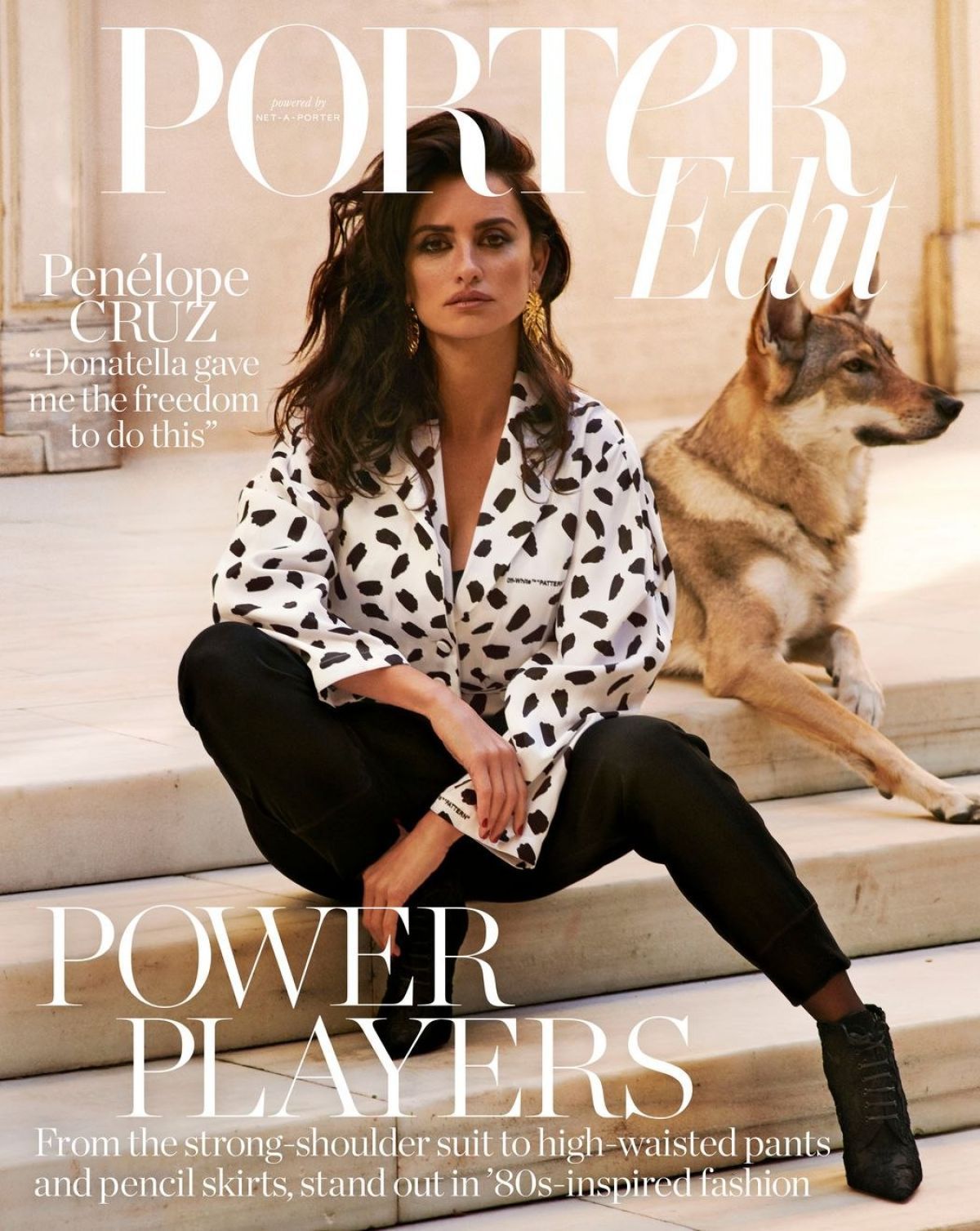
The full body shot of Cruz portrays her as a strong female figure. As this magazine is aimed at women and lifestyle, women will want to buy it because they will want to feel as strong and Cruz looks. Her eye line matches the reader which also invites the reader in. The white copy also brings elegance and a classy feel to the magazine, as it is high end and more expensive than lower class magazines. The colour scheme also offers a high end feel, it's very neutral in the back, whereas Cruz is wearing black and white which makes her stand out. The colour pallet feels very expensive and high end, making the reader become envious of Cruz. The coverlid "Donatella gave me the freedom to do this" refers to her role as Donatella Versace in "The Assassination of Giani Versace". the reader might not know that she played Donatella but a 16-25 AB audience will know who Donatella Versace is. This fashion icons sister plays a big part in the brand today and is well known in the fashion industry, so when they see her name they may want to buy the magazine to find out more. She also seems to be sitting somewhere in an expensive home abroad that may possibly be owned by Cruz. The dog in the background looks like a wolf. This makes Cruz look superior as her expression and body language makes the reader feel like Cruz is one with the dog and as powerful as it. It also makes Cruz look exclusive as she has a dog that looks like a wolf, which most people don't have and it was most likely an expensive dog.
They also might replicate the style in the magazine cover because of its expensive and trendy look. The magazine title covers Grande's head but this doesn't draw the attention from her, the title being in red helps the reader to see the title as well. There is a good balance between the title and the image. The colours are also very classy, they are bright and high end, for example, red and black are royal colours. This can reflect the aims of the sort of people reading Vogue and what they are wearing and how they style themselves. They also stand out on the nuetral background and draw the readers attention. Ariana has direct eye contact with the reader and this gives a more inviting feel and will make the reader want to buy the magazine.
Ariana's fans will also feel influenced to buy the magazine because she has such a large fanbase and Vogue knows this. They have used Grande as the main cover picture because of her star image and she also shows the magazines ideals because Ariana is a strong supporter of feminism and is very influentual. Her fanbase is also likely to fall in the 16-25 category that read Vogue, therefor the magazine will sell well. The whole feel of the magazine feels very feminine and classy, this appeals to 16-25 AB women and their lifestyles. The cover line mentions Ariana's "year that changed everything". This sounds very interesting to not only Ariana's fans but also those interested in pop culture. This cover line is also very general and not specific so it leaves the reader wondering what happened and wanting to read it.
The mid shot of Kai takes up almost the whole of the magazine cover. They have used him as the cover picture because of his huge fanbase in South Korea (where this edition was sold) and because he is attractive. He is an idealistic figure in South Korea because he is a K-POP idol, as well as slim, tall and has strong masculine facial features. He also has a global fanbase that will buy the magazine from websites overseas. He has been recognised by American fashion and beauty companies for his visuals and therefor he is appealing to many people. He also covers part of the logo because of his importance and the fact that the magazine is so well known that they feel they don't need to show the whole thing. This also adds to the 3D affect as well and the eye line gaze. The title is also not at the top centre but it is in the top left. This could be because people read from left to right and because the name of the magazine is so short.
The colours feel very warm and royal and give off an expensive feel that could be inviting to the reader and make them feel warm and homey when reading it. This could also help to attract a 16-25 AB female readership because it offers an expensive feeling lifestyle. The clothes Kai is wearing also give an expensive feel and the reader may want the same lifestyle and will buy the clothes for the males in their lives. This might make them want to buy the magazine because the contents will be similar to the cover. Kai has eye contact with the reader but its more of a side eye look which appears more seductive which might appeal to an older female audience. There is also very small and unimportant cover lines on the left. The white stands out and is classy against the dark background and picture. Its boldness helps capture the readers eye line on a magazine shelf or wherever they're buying it from. The play on words however, "EXOCLUSIVE' isn't particularly high end and more tabloid like. The reader buying the magazine may not care about this as Kai's fanbase are going to be the majority purchasing it.

The full body shot of Cruz portrays her as a strong female figure. As this magazine is aimed at women and lifestyle, women will want to buy it because they will want to feel as strong and Cruz looks. Her eye line matches the reader which also invites the reader in. The white copy also brings elegance and a classy feel to the magazine, as it is high end and more expensive than lower class magazines. The colour scheme also offers a high end feel, it's very neutral in the back, whereas Cruz is wearing black and white which makes her stand out. The colour pallet feels very expensive and high end, making the reader become envious of Cruz. The coverlid "Donatella gave me the freedom to do this" refers to her role as Donatella Versace in "The Assassination of Giani Versace". the reader might not know that she played Donatella but a 16-25 AB audience will know who Donatella Versace is. This fashion icons sister plays a big part in the brand today and is well known in the fashion industry, so when they see her name they may want to buy the magazine to find out more. She also seems to be sitting somewhere in an expensive home abroad that may possibly be owned by Cruz. The dog in the background looks like a wolf. This makes Cruz look superior as her expression and body language makes the reader feel like Cruz is one with the dog and as powerful as it. It also makes Cruz look exclusive as she has a dog that looks like a wolf, which most people don't have and it was most likely an expensive dog.


Comments
Post a Comment